
It’s time for a back and forth email chain between Tim & Brendan about the jerseys at the upcoming World Cup of Hockey.
From: Tim Culverhouse
To: Brendan Murray
Subject: How sexy are the World Cup of Hockey jerseys
Brendan,
Less than a month until the World Cup of Hockey in Toronto. That also means that we’re closer to the beginning of the NHL season. Either way, I can’t wait until hockey comes back. And the World Cup coming back in 2016 after a 12-year hiatus means that we get to rank something else.
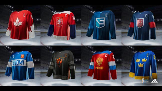
Yeah, that’s right buddy. I’m talking the jerseys for the World Cup. But here’s the caveat. Since we both agree that Team USA has the best jerseys (And the white one is better) we can’t put those in the rankings. So we’re going 2-8 for the rest of the teams in the World Cup. And let’s not get into the advertising on the jerseys either. I don’t think it’s a big deal, so let’s tackle that one another time. Or not at all. Our call.
Here’s my ranking.
2. Sweden
3. Russia
4. Finland
5. North America
6. Canada
7. Czech Republic
8. Europe
The three crowns for Sweden is so classic and timeless. The yellow jersey kicks ass. Always just so sleek and sexy. The “Poccha” jerseys for the Russians reminds me of the Cold War jerseys. They’re so hateable, but damn do they look good. And Suomi is always awesome too. I liked the old Finland jerseys where Suomi was smaller, but making in the focal point of the blue jersey is freaking awesome.
And then I think this is where we will have the biggest difference. Team North America (U-23) has an odd, futuristic color scheme, but I can’t take my eyes off it. I love the logo and XXIII under the crest. It looks like a jersey made for younger players, and Adidas delivered. As for Canada, the maple leaf looked great on the Olympic jerseys. There was no need to change it. The added design on the sleeves just seems forced to me, and I don’t really like it. The Czech jersey doesn’t really do it for me either, and Team Europe is just brutal. I was always told never to combine black and blue, and then the logo is just weird. I can’t explain it in any way, shape or form.
There you have it – what say you?

From: Brendan Murray
To: Tim Culverhouse
Subject: RE: World Cup of Hockey jerseys–and how about the pads?
For once, Tim, I didn’t find myself engulfed in a red hot fit of rage after reading one of your opening salvos, so good on you there.
I’ll take the blue sweaters over the white edition of the Team USA get up, but I agree that either one of those would be just fine at the top of my list. And the ads don’t bother me either, so we can leave that one alone for now.
The one thing I’ve got to say is that I think you did the young guns a disservice. Sure the U-23 rising stars team is perhaps the worst idea of many that make up this tournament, but their jerseys are as hot as they get.
You say you won’t be able to take your eyes off them, and that will be even more true once the puck drops and the action begins. I’d rather see the young stars have a chance to compete on their native teams, but there’s little arguing against the idea that putting the best young North American players together is going to make for an exciting and high-octane brand of hockey. Outside of the actual American team, that squad will probably get the majority of my TV time, at least in the pre-medal rounds.Add that black and orange color scheme to the mix, and I’m liable to watch them every minute they’re on the ice.
So if the good ol’ U.S. of A. is first and the U-23’s are second, what’s the rest of my list look like? I’m glad you asked:
3. Russia
4. Sweeden
5. Canda
6. Czech Republic
7. Finland
8. Europe
Like I said, we almost see to eye on the jerseys. Which brings me to my next point: what goalie has shown off your favorite pads so far?
We’ve seen some stars and stripes from American Cory Schneider, a Family Guy tribute from Petr Mrazek of the Czech Republic and a classic look from Thomas Greiss of Team Germany (and your New York Islanders.)
Who you got?

From: Tim Culverhouse
To: Brendan Murray
Subject: World Cup of Hockey – goalie pads edition
Brendan,
I don’t like this. We shouldn’t pretty much agree on that. That’s not my style. Isn’t my point of being on this site with you to bitch and have outlandish takes that get you (and the general audience) fired up? I feel like I fucked up the jerseys. But it’s in print, so I’ll leave it at that.
And goalie pads & equipment, that’s a great transition. So in the spirit of this, and to not impede on the already funny and awesome selections that you’ve shared, I have two more that are also freaking awesome. With that said, Peter Griffin climbing CN Tower as King Kong and Corey Schneider taking the stars and stripes to his pads are both awesome looks. Anything American just gets me all hot and bothered.
Ok, back to some other ones. Michael Neuvirth is on Team Czech Republic. That should raise some eyebrows, since he’s really not that good. But, his mask is pretty sweet. He used 3D paint for the red, white and blue of the Czech Republic, and then added the famous checkerboard design on the side. Coupled with a silver facemask, and boy, is that a sexy look.

But the real winner here is from the Stanley Cup-champion Pittsburgh Penguins, and Team North America – Matt Murray. We disagreed a tad on the uniform, but this helmet and eventual pad combo knocks my socks off.
This mask looks mean. It takes the color scheme and adds some silver and reflective colors to really pop. Murray might not be the best goaltender in the tournament, but he will most definitely look the best. If I’m a shooter facing Murray, no way I’m scoring with this look staring me down.

Winner. Jackpot. Yahtzee. That’s my leader in the clubhouse. God bless this tournament. Is it September yet?

2 thoughts on “Back and forth: Ranking the World Cup of Hockey jerseys & equipment”